
Enhancing AI with Visual Design: Creating Clear and Intuitive Dashboards
This article supported by AI
3/28/20251 min read
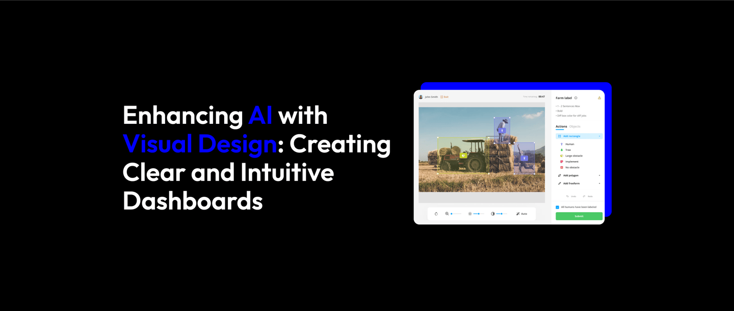
How Visual Design Resolved Dashboard Inefficiencies in AI Systems
In many AI-driven industries, user interfaces play a key role in how efficiently operators interact with complex data. One such case involved a dashboard used for image recognition tasks. The original design was cluttered, complicated, and slow, causing operators to struggle with errors and delays.
The Challenge:
The dashboard was used for labeling and categorizing images, a task requiring quick and precise decision-making. However, the interface’s excessive complexity made it difficult for operators to navigate efficiently. Too many steps and poorly organized data led to human error, impacting performance.
The Solution:
To tackle this problem, a redesign was initiated, focusing on creating a cleaner, more intuitive interface. The new design was based on user-centered principles, which meant understanding the pain points of operators. Research and feedback sessions were conducted to understand the core difficulties. The team used these insights to prioritize what information was most essential and how to present it.
Key elements of the redesign included:
Clear Visual Hierarchy: Grouping related tasks and providing a logical flow helped operators process data with minimal effort.
Color Coding and Visual Cues: Colors and icons were strategically used to differentiate between different types of data, making it easier to recognize and classify images.
Simplified Navigation: Reducing the number of steps required to complete tasks was a major factor in decreasing operator errors.
The Results:
After the redesign, operators experienced a much more efficient workflow. The clearer structure of the interface meant less confusion, fewer errors, and faster completion of tasks. User feedback was overwhelmingly positive, with operators noting how much more user-friendly the new design was. The company reported increased productivity and fewer mistakes, ultimately enhancing the overall AI system’s performance.
This case illustrates how visual design can significantly improve AI systems’ usability. By prioritizing the needs of the users and making the interface intuitive, the design not only solved immediate usability problems but also improved long-term operational efficiency.
Reference:
https://shorturl.at/8veQ6